
What is to be sought in designs for the display of information is the clear portrayal of complexity. Not the complication of the simple; rather the task of the designer is to give visual access to the subtle and the difficult--that is, the revelation of the complex.If you're serious about data, you should be serious about charts.
--Edward Tufte
Like many IT professionals, I once scoffed at charts and reports. These were for polluting PowerPoint presentations, cluttering inboxes, or bringing an end to too many trees. I certainly never wanted to be a reports writer, the lowliest of all data professionals.
But if a picture is worth a thousand words, a good data graphic is worth tens of thousands of data points. It displays the relationships between numbers in a manifest way. It reveals causality and correlation. It shows at a glance the reasons behind the numbers.
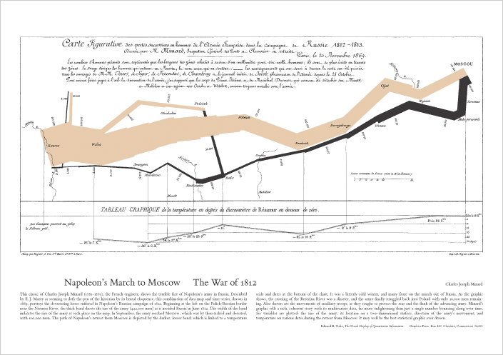 |
| 6 kinds of data in one image = Joy |
I've had users cry with joy at the sight of a chart. This is often hard for us IT professionals to appreciate, since we secure, transform, and display data, but often don't really understand what the numbers mean. It's also hard to appreciate the power of a chart when you can write a query to get whatever you want.
But I think the main problem with taking data graphics seriously is that they are so frequently abused. They display small and unrepresentative data sets, using more ink (or pixels) than words would need. They are cluttered and sensational, meant to grab the eye rather than convey information. They are meant to supplement a lack of data rather than complement an overabundance of it.
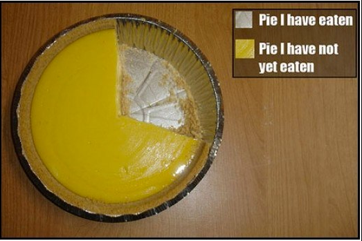 |
| Perhaps the only good pie chart |
-Use only as many graphical dimensions as you have dimensions of data. For example, do not use 3D graphics to show pure quantities
-Erase or omit any graphics that do not show the data
-Make your grids and axes show data points, not arbitrary periods
Admittedly, the architects of the charting software you'd use to create data graphics have absorbed Tufte's ideas. I have not seen too many Excel charts that made me weep. But it's worth studying the history of data graphics, comparing good and bad graphics, and trying to understand the difference between the two.
Admittedly, the architects of the charting software you'd use to create data graphics have absorbed Tufte's ideas. I have not seen too many Excel charts that made me weep. But it's worth studying the history of data graphics, comparing good and bad graphics, and trying to understand the difference between the two.
Links:
-Tufte's seminal book
-Jeremiah Peschka's suggestions for letting the users make their own reports
-DataVis's gallery of charts, good and bad
-DataVis's gallery of charts, good and bad
No comments:
Post a Comment